Urban75 Home About Offline BrixtonBuzz Contact

Show us yer house and house-related meddlings

Finally some work. Plastering has started here.

One thing we hadn't really thought of, and is going to be a success, is this weird box structure:

1601399624117.png

That's gone now in favour of a slope that follows the roof line (more to do on it obviously) and lets more light into the room:

1601399656138.png

Coving is in some trouble but can be resolved:

1601399711578.png

And the rad arrived:

1601399726645.png
 
There's even more of that in the room next door, and that can eventually fuck off too:

20200929_191439_copy_1209x680.jpg

One of those nice moments where, whilst it was a skeleton with the plaster removed, I got to say "hold on a minute, why don't we..." and actually change something, so I'm very pleased about that.
 
They look like they probably date from that period last century (when was that?) when people felt it was a good idea to install false hanging ceilings for no other reason than to make their homes just a little smaller and darker.
If I remember right, its a vaguely arts and crafts ish type house. And its a decision I can imagine being made at that time for stylistic reasons. They quite liked things like window nooks and also they quite liked doing things like that which kind of compress the vertical scale of the room in places. Sort of cottage like. It's also a little bit japanese to do that kind of thing. Fashionable then too. And you can run your picture rail right round the room.
 
I think, given that it had the same dowel (?) at the edge as the chimney breast, and was full of lath and plaster shit, it was probably original. It's an Edwardian house, I wouldn't say it has a strong thematic style but I certainly think they liked to experiment with features a bit and this was an example of that. There might also be an element of the new setup being made much easier by plasterboard.

The picture rail is a good point too. We'll be redoing those freshly by the way but they will have to skip that area I think.
 
If you remember this:

Finally some more meddling - very expensive accoya windows (the two top ones).

View attachment 192613
This sort of explains the layout of both rooms - we are plastering the room with the left hand window and the single window left of the panel. The external wall is further out in that corner of the room but the roofline remains a constant so they had to deal with this discrepancy somehow. What the arch was for in design terms is another mystery.
 
Ah yes. Would have been a projecting bay originally, like next door. Which would have had its own lower 'ceiling' so they decided to extend that into the room a bit. But also it's disguising the bit of pitched roof, which you have revealed but they would have preferred to rationalise, partly because of things like the picture rail. And the coving, which now doesn't make sense there, because it's not a 90 degree wall/ceiling junction.

The traditional purpose of coving was partly to hide locations where cracks would likely appear.

Now we often bodge those junctions with slightly elastic fillers, and so on, doing away with coving and going back in with the filler if a crack does appear.
 
Good point about the bay, I'd not considered that. There will be a bit of something below the coving, you can't really see it clearly in the photo but it doesn't join up to the sloping section yet. When the ceiling gets done, there will be a piece to reconcile the two.
 
Interesting. The aspirations & ideas behind seemingly pointless things like this are really fascinating. We must surely be due for a return of the nook, after all that open plan stuff. Maybe it could be charted against world events, like short skirts and economic upturns.
 
Actually, to do 'open plan' well, you need to have quite a bit of that kind of stuff. You'll see similar devices in quite a lot of modernist stuff. The fiddly decoration is gone but space is still subdivided, often not by walls but things like changes in ceiling height or floor level. Designing a big dumb box doesn't generally work, especially for domestic buildings. In fact it's a mistake I see made all the time with rear extensions - just thoughtlessly make as big a box as possible and stick in a load of glazing along one end. And you end up with a cavernous room which is actually quite hard to use or furnish or feel comfortable in. There's open plan and there's open plan.
 
Got this old poster of gsv's reframed and hung it in our spare room that's basically now my home office so from now on it'll look less like I'm in a spartan prison cell when on camera in meetings. The framer found this rather unusual rather 80s (I thought) frame and it works really nicely.

20201010_194208.jpg
 
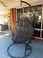
I scored this for free today off a local fb group. It needs a lick of paint and some cushions, but otherwise in perfect nick. Can’t decide what colour to paint it though. What do you reckon? It’s going to go out by the pool so I’m thinking either white which is a bit boring, or painting it something very bright indeed. Not sure!
 

Attachments

  • 5BCD84B5-6527-472C-A60A-042D5C9B30D8.jpeg
    5BCD84B5-6527-472C-A60A-042D5C9B30D8.jpeg
    591 KB · Views: 37
  • 969436E1-D340-4597-A0D6-7B2E3F2BED55.jpeg
    969436E1-D340-4597-A0D6-7B2E3F2BED55.jpeg
    410.5 KB · Views: 34
I scored this for free today off a local fb group. It needs a lick of paint and some cushions, but otherwise in perfect nick. Can’t decide what colour to paint it though. What do you reckon? It’s going to go out by the pool so I’m thinking either white which is a bit boring, or painting it something very bright indeed. Not sure!

Is it metal?
 
What's the plan for painting it? Spray the whole thing? I think that's going to be very difficult to do well such that it lasts. Even a professional paintshop would probably want to do things like clean and abrade the surfaces first which is basically impossible. Limiting it to the frame and base might be better.
 
Base is a little rusty. My mates husband is a painter so will ask him for advice, but you might be right about just painting the frame. The rest of it is wicker, but it’s been treated with something. The person I got it off says it’s sound, he just got bored with it.
 

Attachments

  • FA535AF1-BEA9-4D30-8FAE-4D06486FB2FB.jpeg
    FA535AF1-BEA9-4D30-8FAE-4D06486FB2FB.jpeg
    446 KB · Views: 9
So from the pov of no experience at doing this kind of thing, I think i'd go for painting the base and frame with something with a metallic sheen. I think a flat colour would look odd against the faded wicker part, which I don't think you can paint, so I think I'd work with the fadedness but getting rid of the rust, if that makes sense. Then I'd then use colour and big bold pattern in the cushions, either orange 60s or 70s style or monochrome, sat next to some plants.
 
Back
Top Bottom