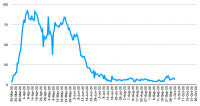
But when I drill down to data I have now for use in hindsight, but that I didnt have at the actual time of the first wave, such as total COVID-19 beds occupied per hospital trust, the picture the first time around is quite a bit more complicated. There are stories to be figured out that the data merely tips me off about but does not provide the underlying story of. I will fish out a couple of graphs and make a follow up post with a pretty vivid example of what I mean, and then I will rant about what unfinished business this reveals that leaves me very unsatisfied right now.
I just cobbled some graphs together to illustrate a point or two but they are rather unpolished. My focus is on the first wave and these graphs vary a little in terms of how much recent data I tacked onto the end of them, but that period isnt the point anyway so...
There is what I would call the classic shape of curve for number of Covid patients in hospital, very similar to all the other sorts of data curves you'll have seen throughout this pandemic. Variations on this shape were seen across many trusts. Here is just one example:

But there are plenty of exceptions to this too, and therein lies stories. Some may be stories of bad data, or when sudden changes happen, a correction of data or change in case definitions. Some might be stories about the success of lockdown in that particular area, or less success, or specific ongoing outbreaks. Some are stories about hospital outbreaks which were eventually spotted and dealt with. Hospital outbreaks that were eventually dealt with is actually a good fit for very many of the different shapes shown, but since I am biased about that issue I am bound to see it and be keen to attribute things I see to that cause, perhaps unfairly.
And when I look at them, I also think of other stories from past months, such as the ones about how lockdown never brought the virus under control in various places up North in the same way it did down south and in the zoomed out, big picture national statistics. I have mixed feelings about some of those stories, because even the hospital graphs I look at do show that even in places that allegedly never got the virus under control in the first place, eventually their numbers did come down, there was still respite for the healthcare service for a chunk of summer. So something must have worked at some point! Which being me often leads me straight back to one of my subjects of strong focus, hospital infections and periods where a grip was eventually gotten on such things. And much of what I say about hospital infections can also be applied to the care home sector.
I'm sticking the other graphs that deviate from the classic one shown above in spoiler tags to stop this post from being way too long when scrolling through this thread. Many other examples are available but I got overwhelmed by the sheer quantity of data, points I could try to make, correlation between extra peaks on some of these graphs and known hospital outbreaks (eg Weston) so I just picked a few examples at random.
Also, in regards to looking for signs of when measures have worked big time, these graphs all have one thing in common - even though the subsequent downwards trajectory varies considerably, and there are timing variations between different places, they all show the moment when the numbers stopped increasing. So the first signs of success were very large and dramatic, even where later moments in the graphs are stories of failure. Although do have to be a bit careful with this point because hospital data is also influenced by admissions policies (including artificial demand destruction by raising the bar for admission), discharge policy, and how many patients are dying and how quickly. So I should repeat the exercise with other data such as admissions, especially when looking for signs in the coming weeks. So I dont consider the following to be completely ideal illustrations for my points today, but they are all I have to hand right now and I'm rushing so I can take a break from this side of things for a little while.
By the way despite all the horrible death-related graphs I've done in this pandemic, so far its actually been the degree of variation between different hospital trust graphs that I've found most upsetting to contemplate. But its just the starting point for further inquiry, I am not in a position to tell all the proper stories that lurk behind the variety of shapes shown.


