Urban75 Home About Offline BrixtonBuzz Contact

The nerdy amounts of pandemic detail thread

elbows

Well-Known Member
I will use this thread when the amount of detail involved is a bit much for the main conversational threads, although if people want to have conversations about the detail in this thread too then I wont see anything wrong with that.

Here is a very large document from mid July on the Direct and indirect impact of Covid-19 on excess deaths and morbidity, and most of the numbers are for England only. It covers a large number of themes in much detail, as well as using an unrealistic modelling scenario where number of deaths after the first peak remains rather static till next March (so there is no real second wave in their resulting figures). I cannot hope to cover everything and will instead start by zooming in on one area in particular.

Also note that QALY = Quality Adjusted Life Years. One QALY equates to one year lived in perfect health.

Anyway, on with the cherry picking....

Screenshot 2020-09-09 at 14.41.04.png
Screenshot 2020-09-09 at 14.42.21.png

D2: Impacts of a lockdown-induced recession
Short-term impacts
The short-term mortality impacts of the lockdown-induced recession are estimated to be 4,500 fewer excess deaths (equivalent to 30,000 gained QALYs) occurring within a year of the lockdown; these are expected to come from an estimated reduction in the number of fatalities due to a reduction in cardiovascular diseases, dementias and respiratory diseases. We assume here that mortality is procyclical – i.e. that a deteriorating economic situation is associated with short-term reductions in mortality rates. Studies have found higher mortality rates during economic booms and lower mortality rates during recessions, with the relationship holding true for previous economic downturns.
The short-term morbidity impacts of the lockdown-induced recession are estimated to equate to 17,000 gained QALYs; they are expected to come from an estimated increase in mental health problems, counterbalanced by a reduction in unintentional injuries (mostly occupational injuries), reduction in chronic respiratory diseases, and reduction in transport injuries.

Medium and long-term impacts
We estimate an increase of 18,000 excess deaths as a result of the medium-term mortality impacts of the lockdown-induced recession, occurring 2-5 years following the lockdown, equivalent to 157,000 lost QALYs; the main impacts are expected to come from an estimated increase in the number of fatalities due to increased cardiovascular diseases. We estimate the medium-term morbidity impacts of the lockdown-induced recession to equate to 438,000 lost QALYs; the main impacts are expected to come from an estimated increase in musculoskeletal disorders and mental health problems.
We estimate the long-term mortality impact of the lockdown-induced recession (more than 5 years in the future) using two different approaches. In the first approach, we use the Office for National Statistics’ (ONS) life tables to estimate the impacts on those who were aged 15-24 during the lockdown-induced recession. We assume a -0.3 GDP-to-mortality elasticity. This estimates 15,000 excess deaths, equivalent to 294,000 lost QALYs; this is from a slightly elevated all-cause mortality impact for younger people who would enter the labour market a few years before, during, and a within a few years after the recession.
It is important to note that the robustness of the medium and long-term impacts of a lockdown induced recession is low as estimates are based on academic literature on previous recessions. The profile of past recessions will be different to a lockdown induced recession, and should be considered when reviewing the estimates.
For the other approach, we use the Index of Multiple Deprivation for England (IMD) and assume a - 1.0 GDP-to-IMD score elasticity per year giving an estimate of 17,000 additional deaths per year for every year that GDP remains at a low level. The timing of when these excess deaths would occur is not specified but they are likely to be long-term.

Screenshot 2020-09-09 at 14.23.35.png
Look at the decrease in years of life lost due to air pollution reductions in lockdown!

Although note that those estimates are not the only ones offered, so I have placed the alternative optimistic and pessimistic versions of that table in spoiler tags below.

Screenshot 2020-09-09 at 14.25.34.png
Screenshot 2020-09-09 at 14.25.50.png

Source: https://assets.publishing.service.g...-covid-19-excess-deaths-morbidity-sage-48.pdf
Via: SAGE meetings, July 2020
 
The slides that Whitty went through at todays press conference:


When looking at the data by age group, I would be inclined to pay less attention to the governments preferred approach of zooming in on some very particular age groups at the top of the charts so they could indulge in a particular message. And more attention to the fact that we can see clear rises in things like the percentage positivity rate across a wider range of age groups than the government focussed on.

Screenshot 2020-09-09 at 19.11.19.png

I note that they also did a slide on the theme I've been groaning about in recent days, the whole attempt to see where we are with this resurgence compared to some European countries that are further ahead, including the likes of Spain and France where their increases have subsequently showed up in hospital data for quite some time etc.

I groaned about '6 weeks behind France' the other day, and then someone else had been briefed about being 2 weeks behind, well now in these slides it looks like they shifted the data by 4 weeks in an attempt to line up UK & French etc trends. Since 2 weeks sounded too short to me (eg France hospital data started its climb more than 2 weeks ago already) and 6 weeks sounded like it could be too long an estimate, maybe 4 weeks will turn out to be right. But there are more questions this time about further variations in what happens next, there is much less certainty that we will follow the same trajectory and numerous opportunities for the trajectory to differ from Frances at some point. Thats why they've stuck Belgium in there, as an example where things started to rise but then evolved in a more complicated manner including a moderate decrease. But likewise theres nothing to assure me that we cannot exceed the upwards trajectory seen in France if thats what the conditions allow to happen with spread here, eg we could yet end up more like Spain on this graph.

Screenshot 2020-09-09 at 19.11.34.png
 
Look at the decrease in years of life lost due to air pollution reductions in lockdown!


As just look the increase in years of life lost to domestic violence too.

The other stuff that has gone up during lockdown is physical-health related.

Accidents and injury due to interpersonal violence and accidents has gone down and that makes sense. Self harm, depression and intimate partner violence has increased, and that seems logical too.

Coercive control and emotional abuse isn’t included here (and that in itself speaks to the hidden nature of these issues) but I dread to think how hideous it’s been for anyone who’s been stuck in that particular hell this year.
 
Last edited:
Yes there were way too many stories in those figures for me to get into them all properly and they all matter, so I am glad if others can draw attention to them instead.

Do note that all those figures are estimates for a particular scenario though, they arent real numbers as such, although I believe some real data was used in the formulation of certain estimates, but possibly only in a very basic way (the document was so long that I fail to recall details of the methodology now).
 
The late July inflection in +ive cases (per 100) appears to have been followed by a late August inflection in the curve for Covid hospital admissions:

1599757984988.png

source
 
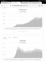
Seems to me that the number of cases and deaths were reducing for a bit but are starting to level off. :(
 

Attachments

  • Screenshot_20200910-181547_Chrome.jpg
    Screenshot_20200910-181547_Chrome.jpg
    227.5 KB · Views: 4
I suppose I will review the weekly surveillance report in this thread.

I dont know quite how much to cover, since people can always skim through the entire thing if they are that interested.


So for tonight I will just cherry pick one thing from todays report.

Among young adults there has been a shift in the demographic of cases in recent weeks from the highest rates among those in the most deprived groups towards those in the least deprived groups.

Screenshot 2020-09-11 at 20.59.39.png
 
I suppose I will review the weekly surveillance report in this thread.

I dont know quite how much to cover, since people can always skim through the entire thing if they are that interested.


So for tonight I will just cherry pick one thing from todays report.


View attachment 229975
Is this people coming back from holiday?
 
Is this people coming back from holiday?

Its probably one of the factors, but I dont have any data to help me actually answer that question. And I probably wont manage to guess all of the other factors too, although I suppose in theory it could involve private parties, raves, bars, gyms, beauty care. And probably that there was more room for differences in risk over time - eg better off people in better off areas were likely to be able to social distance themselves more effectively and with less pain during the acute lockdown phase, but once there is that sense of moving past that phase, they are more likely to stop taking advantage of that particular aspect of being in a privileged position.
 
Yeah I'm annoyed with myself for leaving restaurants off my earlier list, as I meant to mention it when I was getting ready to post and then I got totally distracted by the other possibilities I pulled out of my arse.

Having a rest from ranting is not something I will consider too often though ;)

Anyway this post is not nerdy enough for this thread so I better include something else from the weekly surveillance report.

Screenshot 2020-09-12 at 00.16.46.png
 
Some more recent SAGE papers were published yesterday. I wont be able to cover them all but will pick on a few.

This one has unintended comedy value as it spends quite a lot of time justifying why the SAGE advice about mass gatherings at the start of this pandemic was rather different to their current stance.


In early advice to SAGE, SPI-M-O advised that the cancellation of large events would have only a modest direct impact on the progression of the epidemic. This was in the context of increasing prevalence where the proportion of transmission occurring in gatherings of hundreds of people is very likely to have been very small, compared to other environments such as in homes, workplaces and leisure facilities such as pubs. Essentially the argument was that shutting large gatherings might lower the reproduction number R, for example, from 2.9 to 2.7.

Since then, behavioural and environmental changes – both voluntary and legally enforced – have reduced transmission by about two thirds in line with a strategy of keeping incidence low and therefore the reproduction number R below 1. In this context, a relatively small absolute increase in transmission has a much larger relative impact on R, particularly whilst R is close to 1 when it could result in R exceeding 1 and therefore a return to exponential growth of the epidemic. This paper cautions that the same absolute increase (say from R =1.1 to R=1.3) would represent a material change in circumstances. In both situations, the consideration is about the incremental difference that large events have compared to not having them. This paper offers advice to SAGE on gatherings more broadly, not just those which are large scale. The overall impact on all such gatherings is anticipated to be much more significant than large gatherings alone.

Screenshot 2020-09-12 at 11.22.06.png
 
I'm not going to restraunts anytime soon. Some good analysis of activity risk here.

View attachment 229984

I'm interested to see where public transport sits in that. Potentially less risky than bars and restaurants.
 
I just found a page of Swedish government stats, can't really understand much of it but it looks like surveillance reports by region, test positivity rates etc. I already posted it on the Sweden thread but may as well put it here too. Concerningly the latest weekly report shows what seems to be a rise in infections in some areas :(

 
Hacent had as much time for this thread as I would have wanted this week, never mind.

This weeks surveillance report contains the usual long mix of stuff but I will highlight just a few things in particular again:


Screenshot 2020-09-25 at 19.01.16.png
(I cant do anything about the missing final part of the list of things that count as 'other' since it is missing from the currently published document at the time of me writing this.)

Screenshot 2020-09-25 at 18.58.17.png
 
I don't find those 'events and activities reported' numbers very useful. They would only mean anything if we could compare them to reports from people who haven't tested positive, surely. If people are eating out about as much as visiting friends and relatives, then things don't look too good for eating out. But if people are eating out quite a lot, and not really visiting people much, then the picture is different. And so on.
 
I don't find those 'events and activities reported' numbers very useful. They would only mean anything if we could compare them to reports from people who haven't tested positive, surely. If people are eating out about as much as visiting friends and relatives, then things don't look too good for eating out. But if people are eating out quite a lot, and not really visiting people much, then the picture is different. And so on.

Well it certainly wouldnt be safe to try to draw strong conclusions from them. To me they are more of a starting point for further study, and are also probably indicative of how limited the data & analysis has been on this front so far. So I suppose I put them here for their novelty value as much as anything else.
 
The ONS has more on the pattern that seemed to emerge a while ago, that the rises switched from the poorer areas to the well off areas, and positivity rates were higher in those who travelled abroad. Also takes a look at some other stuff such as increased positivity in the under 35 age group, and higher levels for those that had more social contacts.


Between 23 July and 10 September, COVID-19 Infection rates have increased primarily in the least deprived areas within each region.

In recent weeks, COVID-19 positivity rates have been higher amongst people who have travelled abroad, although increases are seen in both those who have and have not travelled.

Screenshot 2020-09-28 at 11.32.15.png
Screenshot 2020-09-28 at 11.33.12.png
Screenshot 2020-09-28 at 11.32.58.png

The Guardian have picked up on this stuff, eg 20m ago 11:14
 
Young, rich and been abroad in the last month socialites.

Right, now I've a good idea who I should be avoiding ...
 
The ONS has more on the pattern that seemed to emerge a while ago, that the rises switched from the poorer areas to the well off areas, and positivity rates were higher in those who travelled abroad. Also takes a look at some other stuff such as increased positivity in the under 35 age group, and higher levels for those that had more social contacts.


View attachment 232127
View attachment 232128
View attachment 232129

The Guardian have picked up on this stuff, eg 20m ago 11:14
So does this imply that >35s are more likely to be doing social distancing properly (and it kind of works, even if you have quite a lot of contacts) whereas <35s tend not to be doing it properly, with unsurprising results?
 
So does this imply that >35s are more likely to be doing social distancing properly (and it kind of works, even if you have quite a lot of contacts) whereas <35s tend not to be doing it properly, with unsurprising results?

I think post #6 suggests that's not much of a bright side, if so.
 
Back
Top Bottom